Yesterday, I stepped out of my home after like 5 days. I am in the middle of a root canal and its painful, even when I dont have any drills or injections in my mouth. Anyways, so I was out and I was going to CP. On the way I saw two new international brands being launched in India. Hudson News (retailers of books, magazines and more recently food, cafe etc) and Dunkin Donuts (retailrs of donuts and coffee etc).
While thinking about these two brands I realized that a brand like Hudson News, probably has no long term future in India (true for most "retailers"). Simple reason. They are in the commodity business. If I set up exact same format at Hudson and called it GargSon and offered as good or better experience, ambiance, convenience, price and service as a Hudson, there is no reason why customers would not flock to GargSon. So if Interglobe (The company that runs Indigo Airlines and is launching Hudson in India), created a new format and a new brand all together, they would have done far better (unless they want to launch house labels or private labels, like a Bharti Walmart).
One may argue about expertise and process experience that Hudson may bring to India from their international presence. But then enough has been written about how India is a different market and how the customers behave, perceive and decide differently.
On the other hand, if its a brand like Dunkin Donuts (being launched by Jubilant Foodworks, master franchisee of Dominoes Pizza in India), customers pay for the product. And for the "association with" and "consumption of" the brand (end of the day its a Donut and there are enough and more good and tasty donuts available in India). The association and consumption of a Dunkin Donuts can not be replicated by a Saurabh's Donuts. And thus, it makes a lot of sense to get international "product" brands in India. These two words - association and consumption - are the only two reasons why host of product brands would do well in India. Starbucks, Ikea to name a few!
And yes, I did try a Dunkin and it was ok. Not close to M.O.D. but it was great to see a Dunkin's in Delhi. Exciting times ahead.
First posted on Sandbox.
Showing posts with label Retail. Show all posts
Showing posts with label Retail. Show all posts
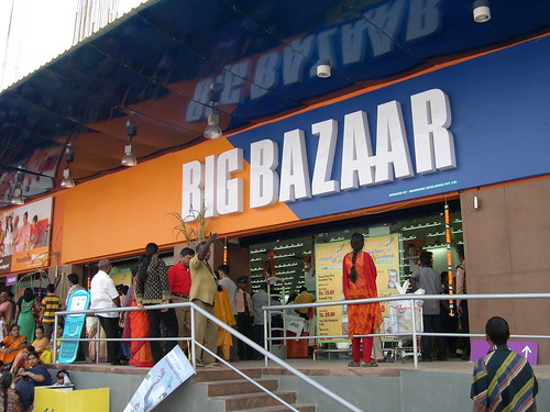
Anil Ambani vs Kishore Biyani on Big Baz(a)ar
Not caring for literary flowerification and language style critics around here, this is going to be rude post.
For people who dont know that specifics, Reliance ADAG is Anil Ambani and Reliance Industries is Mukesh Ambani.
Reliance ADAG has made clear their intentions on getting into organized retail. People might remember that ADAG and Reliance Industries had a non-compete agreement when Mukesh Ambani and Anil Ambani agreed to split in 2006. Terms of this agreement were not made public but how in the world can Anil Ambani get into organized retail when everyone knows about Reliance Retail and its hazaar different retail formats and more than 500 stores?
And if this was not enough, ADAG's retail venture is called Reliance Big Bazar. Surprised? Not really. Shocking? Yes. What about Kishore Biyani's company called Pantaloon Retail and their flagship retail store Big Bazaar?
Perfectly understandable that ADAG calls all their businesses BIG. Big FM, Big Music, Big Flix, Big Entertainment etc. but Big Bazar? I always thought that CGA will not allow you to name your company that confuses customer will an already existing brand. If there was small guy in some class C town in India doing the same thing, he would have been sued for his every penny for corporate lawyers.
If the name was stupid, the reason given by ADAG is even more stupid. They are saying that Kishore Biyani's company is called Bazaar with two a's and their's is called Bazar with a single a. With even bad Photoshop skills, one can very easily make the two logos very similar and rest can be left to anyone's imagination. They have said that they would not use the word "Bazar" or "Big Bazar" on standalone basis. They will always use "Reliance Big Bazar". This saves some grace for them.
But overall a very bad move. And Isn't this piggybacking on someone who has put in time and effort to create a huge brand? What about customers? Isn't this a cheap way to get customers?
India asks Y.
Image Credits: http://farm1.static.flickr.com/142/349070891_d279d63b80.jpg
Ceat, Shoppers Stop and Godrej Rebranding stories
Three very big Indian brands have gone for a makeover. Godrej, Shopper's Stop and Ceat. Before I get into a long rhetoric on these individually, I think except Godrej, Shopper's Stop and Ceat have got it wrong.
Godrej Industries Ltd.
Godrej has added colors to it age old logo. Shoppers' Stop and Ceat have completely changed their looks. Also, Shoppers' Stop says "Change is Good" and Ceat says "Change is here". I wonder if both these have been created by same team?

Godrej the behemoth that sells everything from shoe polish to animal feed to almirahs to locks to lavish food for rich to real estate to a lot of things unimaginable has got a new look. They did not do anything drastic. They retained their logo. Added some animation, color and jazz to it. As a customer I love what they have done. For me I have grown up in house where we had tons of Godrej almirahs and locks and for me Godrej means trust. Is the new look enhancing that? No it does not but it gives me a sense that owners are trying to reinvent the old company and are committed about it. And since And are they doing it because a Godrej Properties is planning to come with its IPO?
Shoppers Stop
Coming on to Shopper's Stop, its is a chain of premium retail megastores. They sell clothes, accessories and other fancy things that riches and the great Indian middle class buys. In fact they are amongst the first players in Indian retail industry to have experimented with large format stores and organized retailing. Their earlier logo and identity was very classy by Indian standards and for the last 10 odd years that logo has been itched in the minds of the customers. It had everything a premium brand's logo should have - curves, stars, symmetry. It was very very appealing. The new logo is anything but premium and yet is a good piece of work on a stand alone basis. But moment you compare it with older logo (and comparison is inevitable), it looks dull. It looks like someone has stepped back in time. To start with it is plain text in a font that can be used by anyone and everyone. A plain text logo could have been good if you added colors, gradients or other elements to break the clutter (hint Godrej). But that too is missing. I think they wanted more serious and elegant look for the brand and the logo has failed to deliver that. I would say this was created by an amateur designer trying random text layouts.

I have no clue what warranted the need for a change in logo. I understand that Shoppers' Stop is coming up with an IPO but did it require a change in look?
Ceat Tyres
Ceat is one of the oldest tyre manufactures in the country. Its a publicly traded company and although I have not had any interactions with their business (never purchased a ceat product), have heard a lot about them. The new logo looks like a half baked pie. Its like work in progress and first time I saw it, I could not relate it to the type manufacturer. When I read the headline, that was the time I realized that it was ceat they were talking about.

As a customer and as an observer, I like their earlier logo better. It had a meaning to it. I could see a rhino and I could conjure an image of a vehicle running on a ceat tyre negotiating hard curves. The new look might also have a road (the E looks like a road with a divider) but it fails to conjure any kind of imagery. Is there a trend in design houses to move towards plain text fonts with minimal use of colors? Or both Shoppers Stop and Ceat have been done by the same agency with a Creative Decision Maker believing that plain text is good and we should talk about change to go along with that?

Its often said an organization is as good as the decision makers it has. I dont really think design teams for both Shoppers Stop and Ceat have done their homework and tried to design a contemporary look. And they should consider the fact that people do not buy products or services. They buy and consume brands. And brand is something that makes the decision process for the consumer simpler. Not more complex by creating conflicting images in their minds.
Design, Advertising and financial markets may sound very different but there is indeed some kind of a relationship. Any more IPOs or redesigns coming up .. ?
P.S.: All the comments are not from an aesthetic point of view. I am hardly a person who has good design sense. I am talking from the perspective of a customer. I have tried to think how would a customer feel when he is interacting with a brand that is supposed to be premium.
All three companies trade on the stock exchanges and I own certain number of shares of Godrej Industries ltd. I might or might not choose to buy/sell these shares.
And I just realized that I am indeed passionate about brands and way consumers think abut brands. As a very good friend would say .. "Aha" moment of the day !
Tags: IPO, Indian Financial Markets, Godrej, Ceat, Shopper's Stop, Retail, India, Design, Logo, Re-design, Advertising, Marketing, Branding.
Godrej Industries Ltd.
Godrej has added colors to it age old logo. Shoppers' Stop and Ceat have completely changed their looks. Also, Shoppers' Stop says "Change is Good" and Ceat says "Change is here". I wonder if both these have been created by same team?

Godrej the behemoth that sells everything from shoe polish to animal feed to almirahs to locks to lavish food for rich to real estate to a lot of things unimaginable has got a new look. They did not do anything drastic. They retained their logo. Added some animation, color and jazz to it. As a customer I love what they have done. For me I have grown up in house where we had tons of Godrej almirahs and locks and for me Godrej means trust. Is the new look enhancing that? No it does not but it gives me a sense that owners are trying to reinvent the old company and are committed about it. And since And are they doing it because a Godrej Properties is planning to come with its IPO?

Shoppers Stop
Coming on to Shopper's Stop, its is a chain of premium retail megastores. They sell clothes, accessories and other fancy things that riches and the great Indian middle class buys. In fact they are amongst the first players in Indian retail industry to have experimented with large format stores and organized retailing. Their earlier logo and identity was very classy by Indian standards and for the last 10 odd years that logo has been itched in the minds of the customers. It had everything a premium brand's logo should have - curves, stars, symmetry. It was very very appealing.
 The new logo is anything but premium and yet is a good piece of work on a stand alone basis. But moment you compare it with older logo (and comparison is inevitable), it looks dull. It looks like someone has stepped back in time. To start with it is plain text in a font that can be used by anyone and everyone. A plain text logo could have been good if you added colors, gradients or other elements to break the clutter (hint Godrej). But that too is missing. I think they wanted more serious and elegant look for the brand and the logo has failed to deliver that. I would say this was created by an amateur designer trying random text layouts.
I have no clue what warranted the need for a change in logo. I understand that Shoppers' Stop is coming up with an IPO but did it require a change in look?
Ceat Tyres
Ceat is one of the oldest tyre manufactures in the country. Its a publicly traded company and although I have not had any interactions with their business (never purchased a ceat product), have heard a lot about them. The new logo looks like a half baked pie. Its like work in progress and first time I saw it, I could not relate it to the type manufacturer. When I read the headline, that was the time I realized that it was ceat they were talking about.

As a customer and as an observer, I like their earlier logo better. It had a meaning to it. I could see a rhino and I could conjure an image of a vehicle running on a ceat tyre negotiating hard curves. The new look might also have a road (the E looks like a road with a divider) but it fails to conjure any kind of imagery. Is there a trend in design houses to move towards plain text fonts with minimal use of colors? Or both Shoppers Stop and Ceat have been done by the same agency with a Creative Decision Maker believing that plain text is good and we should talk about change to go along with that?

Its often said an organization is as good as the decision makers it has. I dont really think design teams for both Shoppers Stop and Ceat have done their homework and tried to design a contemporary look. And they should consider the fact that people do not buy products or services. They buy and consume brands. And brand is something that makes the decision process for the consumer simpler. Not more complex by creating conflicting images in their minds.
Design, Advertising and financial markets may sound very different but there is indeed some kind of a relationship. Any more IPOs or redesigns coming up .. ?
P.S.: All the comments are not from an aesthetic point of view. I am hardly a person who has good design sense. I am talking from the perspective of a customer. I have tried to think how would a customer feel when he is interacting with a brand that is supposed to be premium.
All three companies trade on the stock exchanges and I own certain number of shares of Godrej Industries ltd. I might or might not choose to buy/sell these shares.
And I just realized that I am indeed passionate about brands and way consumers think abut brands. As a very good friend would say .. "Aha" moment of the day !
Tags: IPO, Indian Financial Markets, Godrej, Ceat, Shopper's Stop, Retail, India, Design, Logo, Re-design, Advertising, Marketing, Branding.
Subscribe to:
Posts (Atom)