Showing posts with label Advertisements. Show all posts

Bande Achche Hain

Just stumbled on this ad by ICICI Pru. And reminded me of how I behaved around #sgMS.

Yeah yeah... I am blowing my trumpet. But that's really how I am was. Honest. Ask her.


Just hope that the new guy she's with takes care of her better than I. After all she is a princess and deserves everything that the world has to offer.

Chevrolet Cruze - Hunter (2012)

Of all the ads that are on TV, because of the sheer number and the frequency with which they bombard you, very few catch you eye, your attention and make you take note of what is happening on the screen. The new TVC for Chevrolet Cruze is one such commercial.

Unlike most great ads, its not a one minuter and there are no powerful characters or dialogues. Its a very simple ad that has just one hero - the product itself. And unlike all car ads, there are no cliched stories and it does not talk overtly about the power, mileage, young adult protagonist or the awesome looks of the car.

Have a look, if you haven't seen already.


The lyrics go as follow...
Run boy run there's a storm on the run... dust... rising!
There's a beast on the prowl, there's a roar, there's a growl... thunder and lightning! 

Wow! Beautiful visuals, amazing lyrics, awesome voice and great music. A brilliant package. There is no way that the target audience for Cruze will not like it.

Talking about the target audience, for any car company, typically the key sets of audience are...

  1. Potential customers - the ones who are actually considering buying a sedan that is high on comfort, value for money and stylish enough for them to buy it. The car must elevate their status within their heads and more importantly, in their peer group. For a prospective Cruze customer, I am assuming, from the commercial, that they are looking at selling it to fast rising corporate kinds rather than the old businessmen. These young men want to play, rather than just commute in comfort. For "play", the hunter and prowl is a brilliant place to be at. 
  2. The automotive fanatics - the kind of people who know what horsepower the engine is, what is the turning radius, the clearance and other such things that are Greek and Latin to people like us. These people participate in forums and post their opinion on portals. These are the people that potential customers actually turn towards for their buy decision. Even though, the commercial has zero stats or numbers, it has everything that would make a car fanatic take note. The drifts and looks will make one search for more. The Cruze website does an ok job at it. 
  3. Dealers/sales team etc - the ones who will actually sell the car. These people are often oblivious to  the content of the ad but need the gratification that the "company" is advertising on TV and is spending money to help sell easier. 
  4. Competitors - merely to take a jab at em ;P

The ad clearly does a good job at appealing at all 4. Even though, it would be tough to get the sales data just for Cruze but it would be interesting to see. At least in this category, premium sedan category, there must be a direct correlation between advertisement and sales. Since in India, a car is a very very high involvement product, its really important for a car commercial to appeal to emotions.

In terms of how a planner would have approached this TVC, a typical planner is trained to think in two dimensions - rational and emotional. Rational - you talk of the benefits that are apparent, measurable and verifiable. Examples could be better mileage, superior looks, impeccable build quality or extra space. Emotional - you talk of benefits that a customer will perceive after they are exposed to your communication and hence are non-quantifiable, subjective and open to interpretation. The examples could be "makes you a hero", "takes you home", "your first car" etc. The rational ones are easy to make and the emotional ones are difficult to pull off.  This commercial is definitely not rational and slightly evolved for classifying as purely emotional.

For the category, the commercial is spot on. Easily breaks the clutter and makes the audience take a note. Take a note of the hunter on prowl! In the end, its a #win commercial for Chevrolet. Kudos to the agency that came up with the insight and wrote this commercial (who?). And to the client that approved the concept and is actually spending money to air it.

I'd rate the commercial a 4 on 5. Go see it. And yes, it makes me want to go and buy the car. Just that I dont have the money to do so. Sigh! 

Disclaimer: Personal, opinion, only. 

Confessions of a Failed Ad Man

So today is day 2 of the Project 1000. Yesterday I managed 1000 words. I think 500 odd here and the other 500 on the secret blog to sgMS. And I felt awesome about it. Of course it would have been perfect if I could manage some more words for Serai. Thats what I am calling the book, for the time being. 

So today's day 2. Let me today talk about something that is really close to my heart. And I have worked on it and failed. And failed how. I'd talk about advertising. Some other day, this post could have been called Confessions of a failed adman. Hang on. Why wait another day. Let me change the title right away. So people who read the blog often (all 3 of you) would know that I worked for an advertising agency at some point in time. I had joined that place hoping that I would churn out things like Jalebi and Cadburys. Only to realize that process is far more complex than merely coming up with scripts and shooting them.

Coming to the post, I shall talk about few recent ads that have caught my attention. And I would talk like a typical Indian customer, rather than an ex-planner.

So, the fabled summer season is on and that means that all the soft drink companies are going to bombard us with commercials celebrating their favorite time of the year. I would talk about Frooti, Appy Fizz (because I have worked on these brands), Coke (because I love the brand and wish to work on it some day) and some more. And I would talk about something that has nothing to do with India or with summers or with drinks. Its just an awesome piece of communication.

And again, these are unbiased perspectives of a common man rather than an ex-adman (or even an ex-planner on two of the above mentioned brands).

Frooti (and Slice)
Love the brand, love the positioning, love the legacy, love the drink. Frooti has everything going right for them. Except the competition. In the market, Frooti competes directly with Pepsi's Slice and Coke's Maaza. Slice has this really cool ad featuring Katrina Kaif. Apart from amazing production quality, great music and striking visuals, the ad is brilliant in the sense that at a subconscious level it places Katrina Kaif and Slice at the same place. So every time a guy desires for Katrina, something in him would crave for Slice as well. And once you have the share of mind, rest is easy.

Frooti on the other hand loses out. This season for some reason (which I havent been able to figure out), they are using Siddharth (who Siddharth? exactly my point!) in their ad. And mind it, in their entire 30 odd years history, they've never had a brand ambassador ever. So the ad is a story of a guy who cant gather enough balls to talk to her object of desire and everyone eggs him to try and talk to that girl. And finally he does speaks. And he does it be saying, "would you have a Frooti with me?". And this is where the entire disconnected is. Let me phrase them as questions. A. Is Siddharth being used as the actor Siddharth (doesnt look like) or as the boy next door? And it if he is the boy next door, why call him Sid? B. Is Frooti trying to make itself synonymous with love? Or with the feeling of togetherness? Or what? My peanut sized brain cant really comprehend. But then I am sure, brains better than I are on it and they have figured the puzzle out!

I dont even recall seeing Mazaa on tv yet. And if I have seen, if I cant recall the ad, it has to be really boring! So in the battle of mango drinks, for the time being, the winner, in my humble opinion is Slice.

Appy Fizz
Next up is Appy Fizz. I absolutely adore this guy. I sincerely wish I had the wit and presence of the mind that this dude has! Wait, hes not a dude, hes actually a drink. A drink with an attitude. And thats the best part. The latest line of commercials with Saif Ali Khan is actually far better than all the previous ones. The jokes are simple to understand (to someone like even I who is as desi as men in India get). Plus when they are using Saif Ali Khan, Saif is not being used as a model to peddle paint or dates or whatever. He is being used as himself. As a super hero. And he is in conversation with Appy Fizz. And Appy Fizz goes one up on him in all the commercials. Not like a battle battle but like in friendly banter than you may have with a friend. It does not pull down Saif's reputation and yet it definitely establishes Appy Fizz as a cool guy to hang out with. Or a cool drink to hang out with in this case. +1 on this one to the team. Here is the commercial. I am sure you can find more on youtube and all of them are as good (atleast the two that I have seen).

CocaCola Coke
Even before I start writing, I know that I would talk highly of coke. They cant seem to get anything wrong with their commercials. The latest ummedon wali ruh, sunshine wali aasha is super brilliant. Instead of using a celebrity to endorse the brand, they have simply used interesting and nice visuals to communicate different ways they open happiness. Open happiness is their global positioning that I think is slowly being brought to India. The latest ad, that they are playing with IPL, has just a couple of young kids, sipping coke out of the same coke bottle with the jingle playing in background. Too bad I cant find it online. I would have showcased it here. A very very simple idea, executed really well. A story that tells you everything and yet leaves so much room for imagination that makes you feel good about seeing a commercial. Coke wins it hands down.

Nike
Finally, I want to talk about Nike. A friend sent this to me. And I was literally blown away by it. Yet again, a simple idea, done very well and more importantly had all the peripheral things around it, to ensure that it does well. The story of a long distance couple, trying to cross the country and come together. Nike as a footwear company enables the two to meet. And to top it all, a catchy song/jingle to narrate the story. Finally, things like free download of the track, ability to share it with people easily, comment on a global website and stuff like that is the peripheral things that make is reach more and more people.


And I guess this is it for this edition of confessions of a failed ad man. The key takeaway for me has to be the realization that best ads are about telling simple stories well and the fact that the product being advertising has to stay in the background and be a mere enabler. (Nike as footwear enables a couple to run to each other, coke as a medium allows you to share happiness, Frooti allows you to say the most difficult words ever etc.) Will add this lesson to my repertoire of marketing and advertising lessons!

End note. So writing does not really take a lot of time. It just requires some patience and some peace of mind. Ofcourse advertising takes a lot more. No wonder :D

Zindagi Roz Class Leti Hai


Wonderful wonderful ad. Wish all communication was this well thought of!

Ads on War of Words


I know I had said that I would never put ads on this blog. But then, as they say, never say never, Akshay (@akshaysurve) told me about his awesome startup - Ads4Good (@ads4good, FB). And it was so compelling, I had to put a banner.

Please click on the ads on the right.

And please spread the goodness. Its totally worth it. It takes one minute to sign up, another minute to complete the profile and few clicks to embed.

This page has all the details. And no, I am not being paid for this. Though Akshay and I do help each other from time to time on things.

Titan - Be More - Advertisement


This is one of those brands whose communication and ads inspired me to choose advertising as a career.

The "New" India Post

Although I try to avoid comments on anything related to work, but this has caught my attention. Exchange4Media reports that India Post has unveiled a new campaign to try and resurrect the 154 year old organization. As a part of the campaign, O&M Delhi has come up with a new logo and a tagline - "Giving wings to your dreams", which in my humble opinions looks like a line created with Dilbert Mission Statement Generator

New India Post Logo


The agency says that the new logo "depicts yellow flourish on a red rectangle, symbolizing an envelope. Yellow represents a rising sun, while red, signifies the dawn of a new era." I mean all that is fine but it lacks the class and panache of the simple, classic and yet powerful logo. Who would remember the "dawn of a new era" few years from now? I did not even realize that the yellow pseudo-swoosh on the red background is supposed to resemble folds of an envelope.

What about all the people that India post touches? Think for a minute about people who live in semi-urban and rural India? For a lot of them, postmen and post-offices act as sources of information, news, money, access to reading and writing, gossip etc. Would these people be able to adapt to the new logo easily? Would that trust on the postal system stay concrete? Wouldnt there be a disconnect in their minds when all of a sudden they see changes in the colors and imagery?

India Post - Old Logo


Agreed that the 150 year old institution is reeling under the pressure from Telephony and Internet (emails substituting letters and postcards), private courier companies (for freight carriage and bulky deliveries) and so and so forth. Agreed that India Post is seen as yet another sarkaari company with bureaucracy, painfully slow work environment, lack of enthusiasm and motivation amongst employees but just a new logo and communication is not the way to go about it.

Project Arrow was an initiative in the right direction - to make post offices more than just delivery and access points for mails (there were talks of setting up Internet kiosks, selling insurance, data collection etc.). The idea was to modernize the postal system and revitalize it. They hired McKinsey to work on the turnaround strategy and with the work so far, I am not very impressed. So much for consults being top preference for management graduates.

Ideally along with a management consult, India Post should be hiring a HR consultant to put some sense in their employees to start with. And then the marketing and branding consultants to help out with communication part. Its always an incremental process and has to be like one baby step as a time.

I am very disappointed with the new logo. And since we live in a democracy, I can not really do anything to stop Mr. Scindhia Junior to actually not use it. And with due course of time we will get used to it. We saw the same with Godrej, Shoppers Stop, Canara Bank, Axis Bank, Union Bank of India and their new logos. There is a huge hue and cry when the new logos are revealed. And with passage of time, people get busy with their lives and forget. The institution losses. The identity is lost. The classic era fades away. Only entity to win is the agency that has created the new logo and has charged pretty bucks for it.

Please note, the opinions herein are purely mine and mine only. Please also see my Discovery of India. The timing of the new logo and my discovery is purely coincidental!

Bill Gates and Jerry Sienfeld Commercial

Bill Gates and Jerry Seinfeld in the new Microsoft commercial.


I simply love it. What do you guys think?

Cadburys Main Khush Hoon Khamkha

This is one of those few ads that I really adore. Khamakha from Cadbury's

Copy:
Khamkha muskuraaon,
Khamkha gungunaon,
Khamkha chalta jaaon main,

Khamkha machalta hoon,
Khamkha fisalta hoon,
Khamkha uchata hoon main,

Main khush aaj Khamkha,
Main khush aaj Khamkha yaaron.

Vid on Youtube:


In fact this is one of the reasons why I jumped into advertising.

One year at Creativeland Asia


This day, last year, I moved from GE Money to Creativeland Asia and its one of those few decisions that I have not regretted or reconsidered.

Reasons are two fold.

1. GE was not my kind of place. It might be very very good place to work and might have very good work policies but it did not work for me. May be I am not programmed to work under structures and rulebooks and guidelines and policies and checklists.

2. Creativeland Asia on the other hand, has been a very rewarding and enriching experience. Its my kind of place. Its my land. Just about over an year old, its not really perfect. It can obviously be better. And I, we at Creativeland are working towards it. Hopefully will see some results soon.

I have learned lots of lessons and have made tons of mistakes in this past year. And Creativeland has truly given me a canvas where I can make mistakes and learn from them. At Creativeland we are moving towards that fictional Utopian world.

Hope the coming year is even better and we get closer to making that revolution happen.

P.S.: Why do I always talk about revolutions?

Visit to Cannes

A sleepy town along the beaches of south of France,
where every one has a convertible car,
at least one super bike,
and few trophy wives,
where all the "brands" from Gucci to Gabana have their store,
where everything is charged at a super premium or more,
a town called Cannes.

Wah wah ... impromptu poetry. :D

On a serious note, I am currently attending the Cannes Lions Advertising Festival 2008 at Cannes (my rants from the fest can be found here). So far its been awesome fun.

I am here till Saturday and then its back to Mumbai. More updates on the trip once I am back to Mumbai.

Fake Characters

Inspired by work done by Phonethics, I also thought I would create some characters. And some lives. Here is the first draft.

Koncious Kapoor
KK is our typical metrosexual Indian. He belongs to a very small time in UP and his is the first family to have stepped out of their town. They hence have an elevated status amongst their peers. Kconcious Kapoor has studied in a boarding school and although he has a modernish outlook towards life, he is still conscious of his background and upbringing. Like any typical young Indian, he wants to get rich quick, become famous and is really scared of facing an audience.


Khoob Bai
Everyone knows that KB is 35ish, claims to be 25ish, looks 30ish and is 45ish in real. She does everything including cleaning utensils, scrubbing floors, acting as the informal communication channel between young lovers, delivering gossip and obviously peeping on personal affairs of her employers. She knows more secrets than the FBI, CIA, RAW, The Mossad, MI6 and KGB combined. And she keeps dropping hints about her (in)famous access to information. She promises her loyalty to everyone but she is loyal to only one thing - money.


Totaram Sharma
better known as Sharma Ji in his colony and Sharma Babu in his office. He is a struggling middle aged government employee who has been a clerk since last 30 years and has seen two salary hikes and one promotion. He is a perpetual landmark on his office canvas. All the kids in his colony hate him for his never ending cribbing about noise and ruckus that these kids make. He has two teenaged daughters that add to his agony in life. He is also known for speaking for hours without making any sense at all.


Toofan Kumar
is in a perpetual state of hurry. He is rushing for something or the other. He even talks as fast as he walks. Folklore has it that he was last seen relaxing when he was standing in the visa queue to US of A. He thinks that world today is full of opportunists and he needs to do something about it. He feels very passionately about all the popular social causes and actively participates in debates around these. Motive is not to save trees or prevent child abuse but to pave a road for his political dreams. And of course the visa was rejected.


Happy Singh
is a typical surd. Happy go lucky, content and hungry - all three at the same time. Thanks to his beard, no one knows where his smile begins and ends. Or if he is smiling at all. He is on the heavier side and has an insatiable appetite. Every time he sees a cow, goat, chicken or any other animal of edible quality, his hunger pangs strike him. He is still single with no immediate plans or chances either. His family lives in Ludhiana and thus he has all the money he needs to live comfortably without working.


This has potential to become a huge business by itself. Not on the lines of what Phonethics is doing but something else. Keep watching.

Ceat, Shoppers Stop and Godrej Rebranding stories

Three very big Indian brands have gone for a makeover. Godrej, Shopper's Stop and Ceat. Before I get into a long rhetoric on these individually, I think except Godrej, Shopper's Stop and Ceat have got it wrong.

Godrej Industries Ltd.
Godrej has added colors to it age old logo. Shoppers' Stop and Ceat have completely changed their looks. Also, Shoppers' Stop says "Change is Good" and Ceat says "Change is here". I wonder if both these have been created by same team?


Godrej the behemoth that sells everything from shoe polish to animal feed to almirahs to locks to lavish food for rich to real estate to a lot of things unimaginable has got a new look. They did not do anything drastic. They retained their logo. Added some animation, color and jazz to it. As a customer I love what they have done. For me I have grown up in house where we had tons of Godrej almirahs and locks and for me Godrej means trust. Is the new look enhancing that? No it does not but it gives me a sense that owners are trying to reinvent the old company and are committed about it. And since And are they doing it because a Godrej Properties is planning to come with its IPO?


Shoppers Stop
Coming on to Shopper's Stop, its is a chain of premium retail megastores. They sell clothes, accessories and other fancy things that riches and the great Indian middle class buys. In fact they are amongst the first players in Indian retail industry to have experimented with large format stores and organized retailing. Their earlier logo and identity was very classy by Indian standards and for the last 10 odd years that logo has been itched in the minds of the customers. It had everything a premium brand's logo should have - curves, stars, symmetry. It was very very appealing.The new logo is anything but premium and yet is a good piece of work on a stand alone basis. But moment you compare it with older logo (and comparison is inevitable), it looks dull. It looks like someone has stepped back in time. To start with it is plain text in a font that can be used by anyone and everyone. A plain text logo could have been good if you added colors, gradients or other elements to break the clutter (hint Godrej). But that too is missing. I think they wanted more serious and elegant look for the brand and the logo has failed to deliver that. I would say this was created by an amateur designer trying random text layouts.

I have no clue what warranted the need for a change in logo. I understand that Shoppers' Stop is coming up with an IPO but did it require a change in look?


Ceat Tyres
Ceat is one of the oldest tyre manufactures in the country. Its a publicly traded company and although I have not had any interactions with their business (never purchased a ceat product), have heard a lot about them. The new logo looks like a half baked pie. Its like work in progress and first time I saw it, I could not relate it to the type manufacturer. When I read the headline, that was the time I realized that it was ceat they were talking about.

As a customer and as an observer, I like their earlier logo better. It had a meaning to it. I could see a rhino and I could conjure an image of a vehicle running on a ceat tyre negotiating hard curves. The new look might also have a road (the E looks like a road with a divider) but it fails to conjure any kind of imagery. Is there a trend in design houses to move towards plain text fonts with minimal use of colors? Or both Shoppers Stop and Ceat have been done by the same agency with a Creative Decision Maker believing that plain text is good and we should talk about change to go along with that?


Its often said an organization is as good as the decision makers it has. I dont really think design teams for both Shoppers Stop and Ceat have done their homework and tried to design a contemporary look. And they should consider the fact that people do not buy products or services. They buy and consume brands. And brand is something that makes the decision process for the consumer simpler. Not more complex by creating conflicting images in their minds.

Design, Advertising and financial markets may sound very different but there is indeed some kind of a relationship. Any more IPOs or redesigns coming up .. ?

P.S.: All the comments are not from an aesthetic point of view. I am hardly a person who has good design sense. I am talking from the perspective of a customer. I have tried to think how would a customer feel when he is interacting with a brand that is supposed to be premium.

All three companies trade on the stock exchanges and I own certain number of shares of Godrej Industries ltd. I might or might not choose to buy/sell these shares.

And I just realized that I am indeed passionate about brands and way consumers think abut brands. As a very good friend would say .. "Aha" moment of the day !

Tags: IPO, Indian Financial Markets, Godrej, Ceat, Shopper's Stop, Retail, India, Design, Logo, Re-design, Advertising, Marketing, Branding.

Quote on Indian Consumers

The average Indian consumer is growing. The urban world is driven by aspiration, quality and value in that order, while the rural world is driven by the same factors in a different order – value, aspiration and quality. It’s funny they want the same things in different ways.

Shivkumar is chief executive officer, Nokia

Taken from AgencyFaqs.com

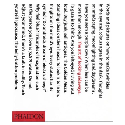
The Art of Looking Sideways


The Art of Looking Sideways is an awesome book by Alan Fletcher. I just bought a copy.

I had blogged about it earlier also on SaurabhGarg.com (on 13th Jan 2008).

This book should help me with a lot of inspiration about design, advertising, creativity, decision making and thinking. Looking forward to reading it.

And now this book becomes the second most expensive book that I have purchased after Still Reading SRK.

Other links
A vid on Youtube where Alan Fletcher talks about it.

Recommendations from a friend

Monica describes me as an "enthu intelli curious will be something soon guy".

Wow. Thanks Monica for such kind words.

Advertising online?

Adlab has posted this comScore press release on banner clicks. One of the most important observation is that
a very small group of consumers who are not representative of the total U.S. online population is accountable for the vast majority of display ad click-through behavior.


What does this mean for online advertising industry?
For brands: Advertising online might be a good idea but its still far from generating the revenues.

Disclaimer
I am using a study conducted in US to base my opinion on. This study might not be relevant in India.

The Nidhi Kapoor Story

Did you like this post? May be you want to read my first book - The Nidhi Kapoor Story.

Check it out on Amazon or Flipkart?